
Hello and welcome to this week’s edition of Friday Fresh!
In today’s deep dive, we’re unraveling the subtle yet powerful elements of course promotion that often fly under the radar but have a significant impact on a learner’s decision to enroll. Let’s explore how detailing the learning journey, font selection, and font size can make or break your course’s appeal.

[1] Clarifying the Learning Journey
Problem: The Unknown Path
Learners face enough uncertainty in their daily lives. When a course description is vague about schedules and expectations, it adds another layer of uncertainty. The prospect of integrating an undefined commitment into an already busy schedule can deter even the most interested learners.
Solution: Map It Out
Offer a clear, detailed course schedule and structure. Specify that a course is “Self-paced, best completed with a commitment of 4 hours per week” instead of describing it as “Flexible”. This approach eliminates guesswork, aligning your course with the learner’s life and schedule, making the decision to engage easier.

[2] The Right Font Makes Reading a Breeze
Problem: Digital Strain
While serif fonts are traditionally associated with printed literature and possess a certain aesthetic charm, they can cause strain and readability issues in digital formats, especially at lower resolutions. This can put readers off when engaging with lengthy course descriptions or detailed training materials.
Solution: Embrace Sans-Serif
Opt for sans-serif fonts in your digital communications. These fonts are designed for digital clarity, making them easier on the eyes and ensuring that your content is accessible to everyone. This choice supports seamless reading experiences, encouraging potential learners to explore your offerings in depth.
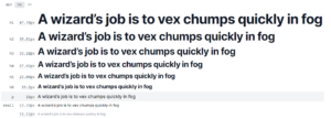
[3] Sizing Up the Font for Better Engagement
Problem: The Size Mismatch
Historically, web content was designed around a 12px font size, suited to the screen resolutions of the past. However, as screen resolutions have improved, sticking to this outdated standard can make your text appear cramped and challenging to read, potentially alienating modern audiences.
Solution: Scale Appropriately
Adopting a font size that’s appropriate for today’s higher resolutions — such as the internet standard of 16px for body text — enhances readability. Depending on the font, you might even consider going up to 18px or 20px. Utilise resources like typescale.com to find the perfect balance between body text and titles, making your content readable and visually appealing.
Final Thoughts
The details that might seem insignificant at first glance can deeply influence a potential learner’s decision-making process. By addressing these key aspects with thoughtful solutions, you can transform your course promotion from just another advertisement into an engaging, learner-friendly invitation.
Let’s make the most of these insights to craft course promotions that stand out for all the right reasons. Until our next Friday Fresh, keep refining and innovating.